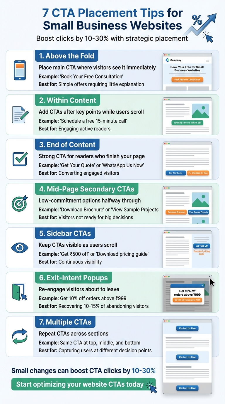
Your website’s CTAs can make or break conversions. Even the most attractive button won’t work if it’s hard to find. Proper placement is key to guiding visitors toward actions like "Get a Quote", "Call Now", or "WhatsApp Us". Here’s a quick summary of the best CTA placement strategies:
- Above the Fold: Place your main CTA where visitors see it immediately without scrolling.
- Within Content: Add CTAs after key points to engage readers who are actively scrolling.
- End of Content: Use a strong CTA for readers who finish your article or service page.
- Mid-Page Secondary CTAs: Offer low-commitment options like "Download Brochure" halfway through.
- Sidebar CTAs: Keep CTAs visible as users scroll through your page.
- Exit-Intent Popups: Re-engage visitors about to leave with valuable offers.
- Multiple CTAs: Repeat CTAs across sections to capture users ready to act at different points.
These tips ensure your CTAs are visible, easy to click, and aligned with user intent. Small changes in placement can boost clicks by 10–30%, directly increasing leads and sales without extra ad spend.
7 CTA Placement Strategies for Small Business Websites
1. Place Your Main CTA Above the Fold
"Above the fold" refers to the section of your webpage that visitors see right away when they land on it – without needing to scroll. This is prime real estate for your main call-to-action (CTA) because you have just a few seconds to direct visitors towards taking the desired action.
For instance, a digital marketing agency in Bengaluru is more likely to click a "Book Your Free Consultation" button if it’s immediately visible. If the button is buried further down the page, they might miss it altogether or assume consultations aren’t available, leading to fewer enquiries.
This placement works particularly well for simple offers that require little explanation. For service-based businesses in India, CTAs like "Request Callback" or "Schedule a Demo" placed prominently above the fold make it effortless for potential customers to engage without scrolling.
To ensure your CTA grabs attention, use bold, contrasting colours and surround it with plenty of white space. Pair this with a strong headline – for example, "Professional Websites Built for Your Business" – and a clear, actionable button like "Tell Us Your Website Requirement". Visitors should understand your offer within 2–3 seconds. On mobile, make sure your CTA is large enough and positioned within easy thumb reach. Whether someone is browsing on a laptop in Delhi or a smartphone in Pune, your main CTA should always be the first thing they see and interact with – no scrolling needed.
For businesses looking to refine their CTA strategy, expert services like those offered by Greenmor can help optimise your design for better results.
2. Add CTAs Within Your Content
Visitors often skim through your website, so relying solely on CTAs at the top or bottom of your page might not be enough to catch their attention. Placing a call-to-action (CTA) after a key section – like halfway through a blog post – gives you another chance to engage readers who are actively scrolling and invested in your content.
The trick is to make these mid-content CTAs feel like a natural continuation of the topic. For example, if you’re a CA firm in Mumbai and you’ve just explained the documents required for GST registration, a CTA like "Don’t want to handle this on your own? Schedule a free 15-minute call with our GST expert" fits perfectly. Similarly, a bakery sharing tips on birthday party planning could include something like "Running out of time? Order a custom cake from us starting at ₹799 – delivery slots available this week." These CTAs align with the content, making them feel relevant and increasing the likelihood of a click.
Position your in-content CTA right after delivering a key insight or completing a short guide. Avoid placing it in the middle of a paragraph, as this can disrupt the reading flow. To make it stand out, use a contrasting button colour, enough white space, and ensure it matches your brand’s design. Since many Indian users access content on mobile devices, prioritise large, easily tappable buttons. Short, clear phrases like "Download checklist", "View pricing", or "WhatsApp us" – ideally within 3–4 words – work best for quick understanding and action.
In longer articles, a single mid-content CTA complements the main CTA at the top and the one at the end of the page. This approach avoids overwhelming readers with too many choices while reinforcing your primary goal. Use the mid-content CTA for medium-intent actions like "Download pricing brochure" or "Get a free demo", while reserving stronger CTAs like "Book a call" or "Start your free trial" for the hero section or the page’s conclusion.
If you’re building your site or using a service such as Greenmor, take advantage of templates with modular CTA blocks. These allow you to easily add CTAs to blogs and service pages, giving you the flexibility to test different placements and messages to see what resonates most with your audience.
3. Add a CTA at the End of Your Content
When someone makes it to the end of your content, it’s a clear sign they’re engaged and interested. They’ve taken the time to read through your message, understand your offerings, and are now more likely to act. This is where a well-placed call-to-action (CTA) can work wonders, turning those readers into leads.
A CTA like "Book a Free Consultation", "Download the Guide", or "Get Your Quote" feels natural and inviting without coming across as pushy. For Indian businesses, CTAs such as "WhatsApp Us Now", "Request a Call Back", or "Schedule a Free Site Visit" are particularly effective, as many customers prefer direct conversations before making a decision. These options cater to the preferences of an audience that has already shown interest by engaging with your content.
The trick lies in ensuring your CTA flows seamlessly with the content. Let’s say you’ve written a blog on choosing the perfect website design for your business – your CTA could be something like, "Need expert help building your site? Talk to our team" paired with a "Get a Website Quote" button. Similarly, if a CA firm has shared insights on GST compliance, an ideal CTA might be "Want expert help with GST for your business? Get a Free 15-Minute Consultation" alongside a "Schedule Call" button. This approach keeps the next step logical and aligned with what the reader just learned.
Design matters too. Use contrasting button colours, simple typography, and enough white space to make your CTA stand out. On mobile, ensure the button is easy to tap – no one wants to struggle with tiny buttons on a small screen.
To build trust, include brief reassurance near your CTA. Statements like "No spam, unsubscribe anytime", "Over 500+ customers served across Bengaluru", or "Pay securely with UPI / cards" can help ease any lingering doubts. If you’re using a platform like Greenmor, ensure your website design supports bottom-of-content CTA blocks with proper spacing. A strong, visible CTA at the end of every page ensures that your engaged audience knows exactly what to do next.
4. Place Secondary CTAs in the Middle of the Page
A lot of visitors tend to skim through your page and stop halfway. If your only call-to-action (CTA) is tucked away at the bottom, you risk losing those who don’t scroll all the way. That’s where secondary CTAs placed mid-page come into play. These CTAs catch users at a natural pause point, giving them a chance to take action before they leave. It’s a smart way to keep their interest and guide them to the next step.
Secondary CTAs work best when they’re low-pressure options like "Download Price List", "View Sample Projects", "Subscribe for Updates", or "WhatsApp Us". These are ideal for visitors who are curious but not quite ready to make a big decision. For Indian small businesses, options like "Get Brochure (PDF)", "See Service Packages in ₹", or "Check EMI Options" can be especially effective. They offer value without demanding a major commitment. The key is to place these CTAs immediately after sections of your page that deliver key information, keeping the visitor engaged and moving forward.
For example, if you run a home interior design business in Pune, you could include a mid-page CTA like "Download Design Catalogue" or "Get Free Quote Template" right after showcasing your portfolio. This feels like a natural progression rather than an abrupt interruption. By aligning the CTA with the content, you make it easier for the reader to take the next step.
Once you’ve figured out where to place your secondary CTAs, pay attention to their design. These CTAs should stand out but not overshadow your primary ones. Use a softer colour from your brand palette or an outline button instead of a filled one. Make sure the button is large enough for mobile users – most Indian audiences browse on their phones – and surround it with enough white space to make it easy to tap. Adding a short, benefit-focused line above the button can also help, like "Get full specs, finish options, and price ranges in a single PDF" or "Be the first to know about festival discounts and cashback offers". This little nudge can significantly improve click-through rates.
If you’re using platforms like Greenmor to build your site, ensure that the design supports modular CTA blocks. These make it easy to insert mid-page CTAs across different templates. A well-placed secondary CTA ensures you’re not just waiting for visitors to scroll to the bottom – you’re meeting them halfway and guiding them toward the next step at just the right moment.
5. Use Sidebar CTAs for Continuous Visibility
When visitors scroll through your website, the main call-to-action (CTA) can sometimes slip out of view. That’s where a sidebar CTA steps in. Placed in the left or right column of your layout, it stays visible as users navigate the page, ensuring they always have access to take action [3].
Sidebar CTAs are particularly helpful for highlighting secondary actions. For instance, you can offer options like "Download pricing guide (PDF)", "Get ₹500 off", "WhatsApp us", or "Book a free consultation." Let’s say you run a coaching centre in Bengaluru – your sidebar could include options like "Download syllabus" or "Enquire for batch starting on 15/04/2026" while your main content focuses on course details. Similarly, a digital agency like Greenmor could feature a sidebar CTA such as "Get a custom website quote (starting at ₹15,000)" with an added note like "Delivery in 10–15 days for most projects". This way, the CTA remains visible without disrupting the main content, like portfolio showcases.
To make your sidebar CTA stand out, design it with a bold, eye-catching approach. Use high-contrast colours – think a vibrant green or blue button on a light background – to grab attention. Keep the text short and actionable with phrases like "Get free quote", "Download brochure", or "Call +91‑XXXXXXXXXX." Surround the button with plenty of white space so it’s easy to spot and click, especially on smaller screens. Adding trust signals, such as "Trusted by 5,000+ customers across India" or "4.7★ on Google Reviews", can further build confidence and encourage clicks.
When it comes to mobile users, adapt the sidebar for better functionality. Convert it into a sticky bottom bar or integrate it into mid-content blocks. Make sure the tap targets are large enough for easy navigation, and test the design on popular mobile devices to ensure a smooth experience [1].
sbb-itb-3716372
6. Use Exit-Intent Popups to Capture Leaving Visitors
Exit-intent popups are triggered when a visitor is about to leave your website, giving you one last chance to engage them before they go.
The key is to offer something valuable at this critical moment. For instance, an e-commerce store selling home décor in Mumbai could use a popup saying, "Wait! Get 10% off orders above ₹999" when a visitor is abandoning their cart. A chartered accountant’s site might display, "Download our free GST compliance checklist before you go," while a fitness studio in Pune could prompt visitors with, "Book your free trial class – limited slots for January 2026." The idea is to align the offer with what your audience values most. For example, if your page discusses website design, a popup offering a "Free website planning template (PDF)" would resonate well.
Once the offer is sorted, focus on the design. Use a high-contrast button – like bright green or orange on a white background – to draw attention. Keep the message short and impactful. Start with a compelling headline, followed by one or two sentences explaining the benefit, and include a single, clear call-to-action button. For example, "Don’t Miss Your Exclusive Offer" could be the headline, followed by "Enter your email to receive a one-time 15% discount code, valid on orders above ₹1,500," with a button labelled "Get My Discount." Also, ensure there’s a visible close button (usually an X) so users feel in control.
Be mindful of user experience. Show the popup sparingly – once per session or week – to avoid annoying visitors. Make sure it’s mobile-friendly, non-intrusive, and has large, easy-to-tap buttons for mobile users. A/B testing can help you determine what works best. For example, test offers like "Free shipping across India" against "₹200 off your first order" to see which one drives better results. Track metrics such as conversion rates, email sign-ups, and revenue to evaluate the effectiveness of your popups. When done right, exit-intent popups can recover 10–15% of abandoning visitors in e-commerce and increase email sign-ups by 50–80% compared to static forms [3].
For seamless implementation and testing, services like Greenmor can help integrate exit-intent popups into your website. They ensure smooth functionality across devices and optimise integration with tools like email marketing platforms or WhatsApp communication systems.
7. Keep CTAs Visible Across Multiple Page Sections
Not all visitors interact with your website the same way. If your call-to-action (CTA) is only at the bottom of the page, you risk losing people who skim through or decide to act earlier. Placing your primary CTA in multiple sections ensures that users can take action whenever they’re ready, no matter where they are on the page.
For example, one visitor might be convinced right after reading about your first benefit, while another might need to see customer testimonials or pricing details. To cater to both, place CTAs like "Book a Free Consultation" or "Get Your Quote in ₹" at the top, middle, and bottom of the page. Imagine an accounting firm in Bengaluru using "Schedule Your Free GST Audit" – repeating it across the page ensures no opportunity is missed.
For mobile users in India, sticky CTAs are especially effective. These are buttons that remain fixed at the bottom of the screen – like "Call Now" or "Chat on WhatsApp" – so users can take action with just one tap, no matter where they are on the page. This is particularly helpful for service-based businesses where customers often prefer direct communication. Just make sure the sticky CTA doesn’t overwhelm the screen; keep the design clean and leave enough white space for easy recognition.
To make this process seamless, small businesses can utilise tools like Greenmor. Whether you’re designing your site yourself or working with a professional, Greenmor ensures your CTAs are placed strategically – above the fold, within your content, and at the end of the page. This way, your site offers a smooth and uninterrupted user experience, optimised for both desktop and mobile audiences in India.
How to Design CTAs That Get Clicks
The design of your call-to-action (CTA) button is just as important as where you place it. A well-designed button can significantly increase click-through rates, making it a key element in driving user engagement.
First, your button should stand out visually. Ensure it’s larger than the surrounding text and contrasts sharply against the background. On mobile devices, aim for a button height of at least 44–48 pixels to make it easier to tap. The colour you choose plays a big role too – go for bold shades that pop against your page’s background. For example, if your website leans on white and light grey tones, a deep blue, green, or saffron-orange button can instantly draw attention. Also, make sure the button text contrasts well with its background so labels like "Book a Free Demo" remain easy to read, even in bright outdoor settings.
Whitespace is another key factor. Surround your button with enough breathing room to make it the focal point, especially on pages packed with text, images, or pricing details in ₹. For mobile users, this is even more critical since they tend to scroll quickly. Group related information closely and then use ample whitespace around the CTA to help it stand out at a glance.
The wording inside the button is equally important. Keep it short and action-oriented, ideally between 2–5 words. Use strong verbs like "Get", "Book", "Download", or "Call" to kick things off. For example, phrases like "Get Your Quote in ₹", "Download Price List", or "Start 7-Day Free Trial" are clear and compelling. When targeting Indian audiences, adding specifics about value or commitment can reduce hesitation. For instance, "Call for Free Advice" or "Check EMI Options" often performs better than generic commands.
Don’t forget to test different variations of your CTA. Experiment with button colours, text (e.g., "Book Free Demo" vs "Get Free Demo"), and sizes to see what drives the most clicks. If you’re running a small business, web development services like Greenmor can help you implement these design principles. They’ll ensure your buttons are the right size, have effective colour contrast, and feature clear, action-driven copy – optimised for both desktop and mobile users across India. By refining your CTA design, you can create buttons that truly align with your business goals.
Adapting CTA Placement to Your Business Needs
Building on effective CTA design and placement strategies, adjusting where you place your CTAs can make a big difference in driving conversions. The key is to customise your CTA placement based on the type of page you’re working with. A product page, a blog post, and a service page each call for a different approach.
For instance, product pages should prominently feature a "Buy Now for ₹1,499" button above the fold. On service pages, CTAs like "Book a Consultation" or "Get a Quote" work best. Place the main CTA above the fold and repeat it after key sections like features, customer reviews, or FAQs to engage users at multiple points during their visit. Blog posts, on the other hand, benefit from a softer approach – start with a CTA like "Download Free Checklist" near the introduction, add a relevant mid-article prompt, and finish strong with options like "Talk to Our Team" or "Start Your Free Audit". Each page type has its own rhythm, and your CTAs should align with it.
Testing is essential. Use A/B testing, scroll tracking, and heatmaps to figure out the best spots for your CTAs – whether that’s above the fold, mid-page, or at the bottom. For small businesses, running these tests over a few weeks can provide actionable insights. For example, if your data shows that most visitors don’t scroll to the bottom, it’s worth moving or repeating CTAs higher up on the page. Keep refining placements based on these insights to ensure your CTAs are working as hard as they can.
If you’re looking for tools to simplify this process, platforms like Greenmor offer pre-designed CTA layouts tailored for Indian users. They provide professional services to customise layouts for product, service, and blog pages, ensuring each page type has the right mix of primary and secondary CTAs. They can also help you set up basic analytics and A/B testing tools, so you can quickly figure out what works – whether that’s adding "Call Now" buttons, "WhatsApp Us" links, or displaying pricing in ₹.
Conclusion
Smart CTA placement isn’t about random guesses – it’s about placing them where users are most likely to notice. Whether it’s above the fold, within your content, at the end of a blog post, in the sidebar, mid-page, or through exit-intent popups, each position has its own role. The real success lies in pairing strategic placement with clean design and regular testing, rather than relying on a single “perfect spot.”
For small businesses in India, optimised CTAs can lead to noticeable improvements – think more contact form submissions, higher “Call Now” or “WhatsApp Us” clicks, and increased add-to-cart actions. Industry data reveals that even minor adjustments in placement and visibility can boost CTA clicks by 10–30% [2]. These gains can directly translate into more leads, enquiries, and revenue growth.
You don’t need a big budget or advanced technical skills to get started. Simple changes like moving your main CTA above the fold, adding a clear call-to-action at the end of key content, and repeating it in another spot on longer pages can make a big difference. Most website builders allow you to make these updates without needing custom code. Use tools like Google Analytics to track performance over the next 2–4 weeks and adjust based on the data.
CTA placement isn’t a one-time task – it’s an ongoing process. Test one change at a time, such as comparing a single CTA above the fold versus adding another at the end of the content. Stick with the versions that deliver the best results. For Indian audiences, localisation is key. Use ₹ pricing, WhatsApp links, and action-driven phrases like “Book a Free Consultation” or “Get a Quote in 24 Hours” to build trust and encourage clicks.
Put these tips into action and see the difference for yourself. If you need expert guidance, Greenmor offers page audits and customised CTA strategies to help you achieve your goals. Start small – choose a high-traffic page, apply these placement strategies, and watch your engagement grow.
FAQs
Where should I place a CTA on my small business website for the best results?
The placement of a Call-to-Action (CTA) can make or break its effectiveness. While the best spot often depends on your website’s design and how users interact with it, here are a few tried-and-tested locations that tend to deliver great results:
- Above the fold: Position your CTA prominently so visitors see it right away, without needing to scroll.
- At the end of the page or a blog post: Once users have engaged with your content, they’re more inclined to take the next step.
- Pop-ups or slide-ins: Well-timed pop-ups, such as those triggered by exit intent, can catch a user’s attention at the right moment.
Experiment with these placements and track metrics like clicks and conversions to see what resonates with your audience. A strategically placed CTA can be a game-changer for driving actions and achieving your goals.
How can I make sure my CTA design works well for mobile users?
To make your Call-to-Action (CTA) design work seamlessly for mobile users, focus on keeping things simple and user-friendly. Opt for large, tappable buttons that are easy to interact with on smaller screens. Position these CTAs in noticeable spots, like above the fold or at the end of important sections, so they’re hard to miss.
Ensure the CTA text is straightforward and action-oriented – phrases like "Buy Now" or "Get Started" work well. Use colours that contrast with the background to make the button pop, while still blending with your website’s overall design. Finally, test your CTAs on different devices to confirm they look good and function smoothly across various screen sizes and resolutions.
What are exit-intent popups, and how can they help boost conversions?
Exit-intent popups are clever tools designed to grab a user’s attention right before they leave your website. These popups detect when someone is about to close the tab or navigate away and display a well-timed message or offer. For instance, they might present a discount, share a free resource, or prompt users to subscribe, right as they’re about to exit.
When done right, these popups can work wonders for your website. They help lower bounce rates, boost engagement, and even drive conversions by catching users at a crucial moment. By transforming potential exits into meaningful interactions, they can become a valuable part of your website strategy.